
 Okay. I had already started this before realizing it was extra credit, but... I had thought of a few different destinations, even Hawaii since I had a few pictures from our trip there last Summer. Seeing as this was supposed to be a group project to work as a team to share background and possible direction, I decided that I'd go with a destination that I knew and understood and at the same time is a very inviting tourist spot for it's culture, my home of Metlakatla, Alaska.
I thought I'd stick with the traditional colors of the native dancing, black and red. I had quite a few photos to choose from and after getting them into a folder of their own, I tried placing a few onto the canvas. It seemed like too many and too cluttered. I wanted to keep it simple with the main idea of what is here in Metlakatla.
I put new the photo of the William Duncan Memorial Church would have to be the first photo, because it is what our town was historically based upon and the first main building built. I tried a few more pictures, but removed them.
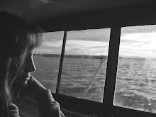
The next photo was the one of our oldest daughter, our beautiful Megan, in my mother's native regalia I had taken for her graduation (2006). Indian Dancing is always alluring for a visitor to watch and her expression was a sweet smile which is also attractive for a possible tourist... warm and inviting.
Hence, I had to have a picture of our long house. I drove down to the longhouse to take a picture and ended up catching one of a totem with seine boats docked in the background. We are a fishing community, so I thought the boats tied that in nicely. I had tried a picture of our boat, but had to remove it because it was just getting to busy.
With that, I played with each photo bringing them to the front then back again, giving some a soft edge, cropping, giving the main photo a beveled edge and a light reflection. The reflection of the canoe almost gives the illusion of the white part of it being a whole different boat on water (this canoe was not there last Summer and I was surprised to see it). Giving the right amount of reflection filled the bottom space between the two photos wonderfully and in a pretty fun and imaginable way without being too much.
The black and white canoe gave me the idea to make the picture of Meg black and white so it balanced out the layout with the picture of the church. I tried to chose a color red for the main title font to match the totem red in the opposite corner instead of the centered to balance out the layout again. Plus I tried to use a font that looked kind of tribal and the one I usually use was not available in this program, however, the one I chose was called "Bradley Hand" and I thought it ironic since my Meg's Boyfriend's name is Bradley. The second font, I wanted to go with the gray tones and more subtle to offset, yet compliment the main title.
When I was finished, I showed my mother and she was so impressed that she said I should show this to the people of our community. Ha! That was compliment enough for me...

No comments:
Post a Comment