I spent days going through all my photos for the color combinations for Summer. I started with shots from Hawaii, shots of the kids/pets, anything Summer and put them in one folder then investigated the different possibilities for color schemes. I wanted a different view, because it seems we always think of one way to do colors. When I came across the firework pictures I took on the 4th of July, it opened the door for exactly what I was looking for.
I decided to use Orange as the main color since it was present in every photo I chose. I will post both results to show how different just the background and text made the same layout of photos look different. The different backgrounds brought out different colors and gave each layout a completely different feel to them.
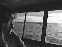
I wanted to bring in photos of the night since a lot of activity goes on at night in the Summer. However, I wanted to keep the feel of the fun daytime activity as well. So I started my photos with a bang of excitement of daytime water activity. The boat was orange and a part of it shows centered on the bottom. The person on that inflatable being towed by my husband, in his boat, is my Mother!! They actually enjoyed themselves and all I could do was laugh nervously while taking pictures from the front of the boat. The next photo is our 8-year-old son, Jackson showing one of his salmon trophes while he worked on a gill-netter (he wore my skiing goggles because he got red jellyfish in his eyes before). Next we have our 12-year-old girl, Alec winding down the excitement flowing the activity into a relaxed sunset (I loved how she had a mask and snorkel on and that is was blue, too). I kept the photo of her cropped to include her reflection, because there was still apparent orange in the rippled water. Steven on the bottom left, has the sunset rays on his face and his boating activity is coming to a close as opposed to the first photo of him heartily enjoying whipping my mom around the water (FYI, they really like each other). The photo on top on the lower right corner is our oldest, Megan lighting off two roman candles. If you look closely, there are at least two angles of her face- one looking at the candles shooting off and one turning to the camera. The sky in this shot had an amazing blue color. Then lastly, we have our youngest (just barely turned 3), Jace Z "Cabee" winding down the explosion of fireworks to a sparkler going out and bringing in the black night. I noticed that firework photos show people's faces looking up. All photo activity working from day to night (light to dark) and excitement to relaxation (bright to subtle).
I chose to accent the photo arrangement with a sunflower. I had taken a picture up close of a sunflower in a gorgeous flower arrangement my husband had given me on our 1st Anniversary in June (getting flowers from my husband is one of the absolutely BIGGEST highlights of our relationship to me, so I take many pictures of them from different angles -besides I have a passion for flowers). I manipulated the color of the petals by adding a splash of orange using the Photoshop paint bucket and letting it flow when I touched an area of the petals. The sunflower not only made me think of Summer and the sun, but with the added orange, it gave the feel of picnic fires and evening bonfires. It is a great complement to all the activity on the page.
I had so much trouble with my computer and trying to figure out how to post these from where I had created them, but here they are none-the-less and much to my satisfaction:

Here it is! This is my interpretation of Season and Color. I chose this for many different reasons:
Black is not a usual color you associate with Summer, but so much activity happens at sunset and night as well as during the day. At night, the color schemes I noticed were black (also apparent in every photo, including the day), Orange tones from the reflection of light on faces and objects or from the light source itself. Black and Orange are match colors. The accent in this arrangement would be blue as it is present in strong and subtle ways and blue is a complement to orange. The background is the same top left section of the sunflower photo cropped. The leaves appeared to light up a night with fire. Then the black empty color on top left to the bright of the petals on bottom right, went well with contrasting the photo color arrangement of bright to dark with the bright photos against the black background and the dark and the dark photos against the bright background. I liked how the opposites attracted. All the bright colors bring out the excitement of Summer -the black just seems to compliment it all and make it more energetic and vibrant. The contrast seems to bring harmony and balance.
The font I chose because of the fun colors against the black and the text appeared to work well with the rhythm of the flower petals. I used a different font for the "Southeast Alaskan Style" to still look fun and have an Alaska Native feel to it while keeping with the rhythm of the flower and using the accented blue didn’t take too much focus away from the Title and theme. I believe I got the mood I wanted to convey for the emotional response I wanted to elicit.

This was our first attempt and although I didn’t choose it, it was still fun and gave the whole piece a totally different feel. I still liked it.
My oldest daughter, Megan, showed me how to watermark the background with images when my first attempt at filling it with a solid orange didn’t work on my computer (my system is messed up). She used the same photo of the sunflower for the background and set the filter to show it softer. Again, it looks like the sun or picnic fire. This background gave the entire piece warmth and the petals gave the feeling of ray movement or that of a soft, warm breeze.
The fonts I used (like the other) wouldn’t convert to her computer, so she used what she had and played with it and it has a simple and fun feel and looked great against the orange and yellow background. The blue ties in the feel of water and sky.
The color scheme in this arrangement is a more true triad built from two related colors of orange and yellow, with the accent (contrast) color blue.
This project result was our first attempt to turn it into a photo for uploading into my blog. The file size was very small because of how we did it, but I had much more success when I transferred the other project into JPEG format.

 I didn't think I'd have time to finish this one, but seeing as I had so much done, I figured I'd put up what I did for the optional 5b project anyway.